Plotting a Suite of Simulations
When we run a suite of simulations, such as when performing sensitivity tests or uncertainty propagation, it can be handy to plot that suite of runs together, and give the viewer a sense for how the uncertainty is manifest over the course of the simulation.
Libraries
In addition to the standard plotting, simulation and data handling
libraries, we’ll use the seaborn plotting library to handle density
plots.
%pylab inline
import pysd
import numpy as np
import pandas as pd
import seaborn
Populating the interactive namespace from numpy and matplotlib
Loading Model
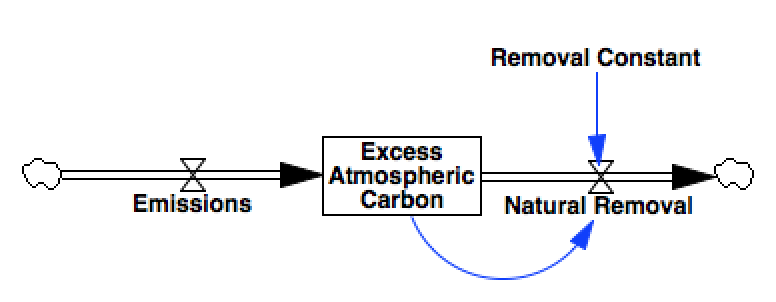
The model we’ll use in this example is a basic, 1-stock carbon bathtub
model, in which Emissions contribute to a stock of
Excess Atmospheric Carbon, which is slowly depleted through a
process of Natural Removal.
 .
.
model = pysd.read_vensim('../../models/Climate/Atmospheric_Bathtub.mdl')
Creating a suite of run parameters
We’ll generate a suite of simulations by drawing 1000 constant values
for the Emissions parameter from an exponential distribution.
n_runs = 1000
runs = pd.DataFrame({'Emissions': np.random.exponential(scale=10000, size=n_runs)})
runs.head()
| Emissions | |
|---|---|
| 0 | 10619.175953 |
| 1 | 10854.493356 |
| 2 | 17405.296238 |
| 3 | 6649.127703 |
| 4 | 4454.821863 |
Run the model with the various parameters
Next we’ll run the model with our various values for emissions, and
collect the resulting timeseries values of the stock of
Excess Atmospheric Carbon.
The resulting dataframe result contains a column for each value
simulation run, and these will form the traces for our plot.
result = runs.apply(lambda p: model.run(params=dict(p))['Excess Atmospheric Carbon'],
                    axis=1).T
result.head()
| 0 | 1 | 2 | 3 | 4 | 5 | 6 | 7 | 8 | 9 | ... | 990 | 991 | 992 | 993 | 994 | 995 | 996 | 997 | 998 | 999 | |
|---|---|---|---|---|---|---|---|---|---|---|---|---|---|---|---|---|---|---|---|---|---|
| 0 | 0.000000 | 0.000000 | 0.000000 | 0.000000 | 0.000000 | 0.000000 | 0.000000 | 0.000000 | 0.000000 | 0.000000 | ... | 0.000000 | 0.000000 | 0.000000 | 0.000000 | 0.000000 | 0.000000 | 0.000000 | 0.000000 | 0.000000 | 0.000000 |
| 1 | 10619.175953 | 10854.493356 | 17405.296238 | 6649.127703 | 4454.821863 | 3560.003419 | 6640.764213 | 23972.691959 | 5816.878223 | 4160.733879 | ... | 5354.787840 | 24506.090733 | 5391.310572 | 5042.198805 | 7717.170753 | 13855.131882 | 1254.482621 | 3288.548916 | 3995.330497 | 689.274481 |
| 2 | 21132.160146 | 21600.441778 | 34636.539514 | 13231.764129 | 8865.095508 | 7084.406803 | 13215.120785 | 47705.656999 | 11575.587665 | 8279.860420 | ... | 10656.027801 | 48767.120558 | 10728.708037 | 10033.975622 | 15357.169798 | 27571.712446 | 2496.420415 | 6544.212344 | 7950.707690 | 1371.656217 |
| 3 | 31540.014497 | 32238.930716 | 51695.470357 | 19748.574190 | 13231.266416 | 10573.566154 | 19723.733790 | 71201.292388 | 17276.710011 | 12357.795695 | ... | 15904.255362 | 72785.540086 | 16012.731529 | 14975.834671 | 22920.768853 | 41151.127204 | 3725.938832 | 9767.319137 | 11866.531110 | 2047.214135 |
| 4 | 41843.790305 | 42771.034765 | 68583.811892 | 26200.216151 | 17553.775615 | 14027.833911 | 26167.260665 | 94461.971424 | 22920.821135 | 16394.951618 | ... | 21100.000648 | 96563.775418 | 21243.914785 | 19868.275130 | 30408.731918 | 54594.747814 | 4943.162064 | 12958.194862 | 15743.196296 | 2716.016475 |
5 rows × 1000 columns
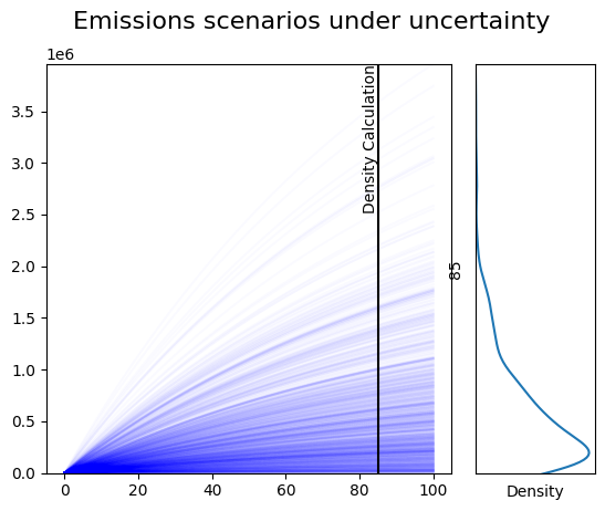
Draw a static plot showing the results, and a marginal density plot
The code below is what we might use for making a static graphic for publication in a print environment. The result is an image, and we have programmatic control over how we want the image displayed and saved.
In the lefthand side of the plot, we draw all traces from the suite of
simulation runs. Plotting each line in the same color, and setting a low
value for alpha, the opacity of each line, we can see the regions of
the plot in which a large number of simulations agree on the values the
system will take, despite the parametric uncertainty.
In the righthand plot, we use a gaussian Kernel Density
Estimator
provided by the seaborn
library. The KDE gives an indication of the regions in which the density
of simulation results is highest, at a specific time point in the
simulation, which we refer to here as density_time.
To indicate the simulation time for which we are displaying a density estimate, we’ll add a vertical line at the point on the lefthand plot at which the density curve is calculated.
# define when to show the density
density_time = 85

# left side: plot all traces, slightly transparent
plt.subplot2grid((1,4), loc=(0,0), colspan=3)
[plt.plot(result.index, result[i], 'b', alpha=.02) for i in result.columns]
ymax = result.max().max()
plt.ylim(0, ymax)

# left side: add marker of density location
plt.vlines(density_time, 0, ymax, 'k')
plt.text(density_time, ymax, 'Density Calculation', ha='right', va='top', rotation=90)

# right side: gaussian KDE on selected timestamp
plt.subplot2grid((1,4), loc=(0,3))
seaborn.kdeplot(y=result.loc[density_time])
plt.ylim(0, ymax)
plt.yticks([])
plt.xticks([])
plt.xlabel('Density')

plt.suptitle('Emissions scenarios under uncertainty', fontsize=16);
Static density plot with selector
For purposes of lightweight exploration, we can add a slider to the chart. In this case, whenever the slider is moved, the figure is regenerated, making this a suitable method for exploring results before feeding in to print graphics.
import matplotlib as mpl
from ipywidgets import interact, IntSlider
sim_time = 200
slider_time = IntSlider(description = 'Select Time for plotting Density',
                        min=0, max=result.index[-1], value=1)
@interact(density_time=slider_time)
def update(density_time):
    ax1 = plt.subplot2grid((1,4), loc=(0,0), colspan=3)
    [ax1.plot(result.index, result[i], 'b', alpha=.02) for i in result.columns]
    ymax = result.max().max()
    ax1.set_ylim(0, ymax)

    # left side: add marker of density location
    ax1.vlines(density_time, 0, ymax, 'k')
    ax1.text(density_time, ymax, 'Density Calculation', ha='right', va='top', rotation=90)

    # right side: gaussian KDE on selected timestamp
    ax2 = plt.subplot2grid((1,4), loc=(0,3))
    seaborn.kdeplot(y=result.loc[density_time], ax=ax2)
    ax2.set_ylim(0, ymax)
    ax2.set_yticks([])
    ax2.set_xticks([])
    ax2.set_xlabel('Density')

    plt.suptitle('Emissions scenarios under uncertainty', fontsize=16);
interactive(children=(IntSlider(value=1, description='Select Time for plotting Density'), Output()), _dom_clas…