Demo of a KDE plot beside timeseries set (Interactive)
%pylab inline
#%matplotlib inline
#import matplotlib.pyplot as plt
import mpld3
from mpld3 import plugins
#mpld3.enable_notebook()
#%matplotlib notebook
#
import pysd
import numpy as np
import pandas as pd
import seaborn
Populating the interactive namespace from numpy and matplotlib
Load the model using PySD
The model is a basic, 1-stock carbon bathtub model
model = pysd.read_vensim('../../models/Climate/Atmospheric_Bathtub.mdl')
print(model.doc)
                   Real Name                    Py Name Subscripts  Units  0                  Emissions                  emissions       None   None
1  Excess Atmospheric Carbon  excess_atmospheric_carbon       None   None
2                 FINAL TIME                 final_time       None  Month
3               INITIAL TIME               initial_time       None  Month
4            Natural Removal            natural_removal       None   None
5           Removal Constant           removal_constant       None   None
6                    SAVEPER                    saveper       None  Month
7                  TIME STEP                  time_step       None  Month
8                       Time                       time       None   None

       Limits       Type Subtype                                     Comment
0  (nan, nan)   Constant  Normal                                        None
1  (nan, nan)   Stateful   Integ                                        None
2  (nan, nan)   Constant  Normal          The final time for the simulation.
3  (nan, nan)   Constant  Normal        The initial time for the simulation.
4  (nan, nan)  Auxiliary  Normal                                        None
5  (nan, nan)   Constant  Normal                                        None
6  (0.0, nan)  Auxiliary  Normal  The frequency with which output is stored.
7  (0.0, nan)   Constant  Normal           The time step for the simulation.
8  (nan, nan)       None    None                  Current time of the model.
Generate a set of parameters to use as input
Here, drawing 100 constant values for the Emissions parameter from
an exponential distribution
n_runs = 100
runs = pd.DataFrame({'Emissions': np.random.exponential(scale=10000, size=n_runs)})
runs.head()
| Emissions | |
|---|---|
| 0 | 13139.288132 |
| 1 | 10414.796999 |
| 2 | 8505.605002 |
| 3 | 55251.743520 |
| 4 | 3650.497881 |
Run the model with the various parameters
result = runs.apply(lambda p: model.run(params=dict(p))['Excess Atmospheric Carbon'],
                    axis=1).T
result.head()
| 0 | 1 | 2 | 3 | 4 | 5 | 6 | 7 | 8 | 9 | ... | 90 | 91 | 92 | 93 | 94 | 95 | 96 | 97 | 98 | 99 | |
|---|---|---|---|---|---|---|---|---|---|---|---|---|---|---|---|---|---|---|---|---|---|
| 0 | 0.000000 | 0.000000 | 0.000000 | 0.000000 | 0.000000 | 0.000000 | 0.000000 | 0.000000 | 0.000000 | 0.000000 | ... | 0.000000 | 0.000000 | 0.000000 | 0.000000 | 0.000000 | 0.000000 | 0.000000 | 0.000000 | 0.000000 | 0.000000 |
| 1 | 13139.288132 | 10414.796999 | 8505.605002 | 55251.743520 | 3650.497881 | 7490.206883 | 5908.429778 | 4526.126740 | 3969.536964 | 42777.645014 | ... | 9654.733184 | 16864.050543 | 15725.059944 | 7426.330819 | 10563.284279 | 5586.831254 | 24433.431913 | 13290.730858 | 6245.476841 | 11057.440643 |
| 2 | 26147.183383 | 20725.446028 | 16926.153954 | 109950.969604 | 7264.490783 | 14905.511697 | 11757.775259 | 9006.992213 | 7899.378559 | 85127.513578 | ... | 19212.919037 | 33559.460581 | 31292.869289 | 14778.398329 | 21020.935715 | 11117.794196 | 48622.529506 | 26448.554408 | 12428.498913 | 22004.306879 |
| 3 | 39024.999681 | 30932.988567 | 25262.497417 | 164103.203428 | 10842.343756 | 22246.663463 | 17548.627285 | 13443.049031 | 11789.921738 | 127053.883456 | ... | 28675.523031 | 50087.916518 | 46705.000540 | 22056.945165 | 31374.010637 | 16593.447508 | 72569.736124 | 39474.799721 | 18549.690765 | 32841.704452 |
| 4 | 51774.037816 | 41038.455680 | 33515.477445 | 217713.914913 | 14384.418199 | 29514.403711 | 23281.570790 | 17834.745281 | 15641.559485 | 168560.989636 | ... | 38043.500985 | 66451.087897 | 61963.010478 | 29262.706532 | 41623.554810 | 22014.344287 | 96277.470675 | 52370.782582 | 24609.670698 | 43570.728050 |
5 rows × 100 columns
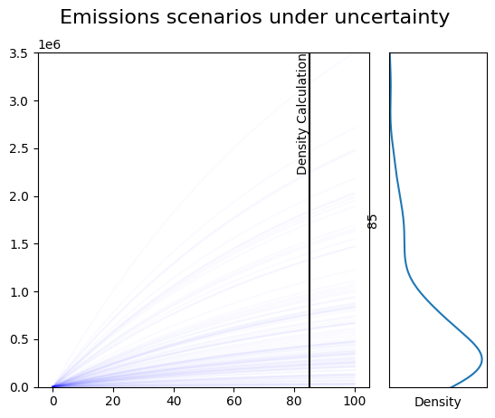
Draw a static plot showing the results, and a marginal density plot
This would be for making graphics for a publication, where you don’t want an interactive view, but you want fine control over what the figure looks like.
This is relatively simple, because we rely on the plotting library
seaborn to generate the KDE plot, instead of working out the
densities ourselves.
import matplotlib.pylab as plt
# define when to show the density
density_time = 85

# left side: plot all traces, slightly transparent
plt.subplot2grid((1,4), loc=(0,0), colspan=3)
[plt.plot(result.index, result[i], 'b', alpha=.02) for i in result.columns]
ymax = result.max().max()
plt.ylim(0, ymax)

# left side: add marker of density location
plt.vlines(density_time, 0, ymax, 'k')
plt.text(density_time, ymax, 'Density Calculation', ha='right', va='top', rotation=90)

# right side: gaussian KDE on selected timestamp
plt.subplot2grid((1,4), loc=(0,3))
seaborn.kdeplot(y=result.loc[density_time])
plt.ylim(0, ymax)
plt.yticks([])
plt.xticks([])
plt.xlabel('Density')

plt.suptitle('Emissions scenarios under uncertainty', fontsize=16);
Interactive plot using python backend
The following would be for lightweight exploration
import matplotlib as mpl
from ipywidgets import interact, IntSlider
sim_time = 200
slider_time = IntSlider(description = 'Select Time for plotting Density',
                        min=0, max=result.index[-1], value=1)
@interact(density_time=slider_time)
def update(density_time):
    ax1 = plt.subplot2grid((1,4), loc=(0,0), colspan=3)
    [ax1.plot(result.index, result[i], 'b', alpha=.02) for i in result.columns]
    ymax = result.max().max()
    ax1.set_ylim(0, ymax)

    # left side: add marker of density location
    ax1.vlines(density_time, 0, ymax, 'k')
    ax1.text(density_time, ymax, 'Density Calculation', ha='right', va='top', rotation=90)

    # right side: gaussian KDE on selected timestamp
    ax2 = plt.subplot2grid((1,4), loc=(0,3))
    seaborn.kdeplot(y=result.loc[density_time], ax=ax2)
    ax2.set_ylim(0, ymax)
    ax2.set_yticks([])
    ax2.set_xticks([])
    ax2.set_xlabel('Density')

    plt.suptitle('Emissions scenarios under uncertainty', fontsize=16);
interactive(children=(IntSlider(value=1, description='Select Time for plotting Density'), Output()), _dom_clas…
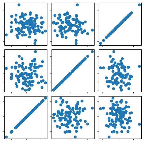
Interactive figure with javascript background
This script would prepare interactive graphics to share on a webpage, independent of the python backend.
fig, ax = plt.subplots(3, 3, figsize=(6, 6))
fig.subplots_adjust(hspace=0.1, wspace=0.1)
ax = ax[::-1]

X = np.random.normal(size=(3, 100))
for i in range(3):
    for j in range(3):
        ax[i, j].xaxis.set_major_formatter(plt.NullFormatter())
        ax[i, j].yaxis.set_major_formatter(plt.NullFormatter())
        points = ax[i, j].scatter(X[j], X[i])

plugins.connect(fig, plugins.LinkedBrush(points))